The podcasts are now availible via iTunes.
Go to iTunes!
05/08/2008
04/08/2008
Presentation Box
01/08/2008
Publication Pages
A collection of photographs I had taken on the allotment, brought together into an interactive book made up of three interchangeable sections that build up a vivid image of the allotment.
This publication is a great addition to the podcast/cassettes as it provides a visual backdrop, and works within a different medium, giving the project as a whole more depth and character.


This publication is a great addition to the podcast/cassettes as it provides a visual backdrop, and works within a different medium, giving the project as a whole more depth and character.


30/07/2008
28/07/2008
Publication
With all the photographs I have of the allotment I'm going to put together a publication, to compliment the the cassettes and seed packets.
The design of the book is strongly influenced by the allotment. Allotments are interactive; a place where people go and force themselves on a piece of land to get want they want from it. Also allotments are ever changing; you wouldn’t recognise individual plots from one week to the next. So I wanted the book to reflect this. I came up with an idea to split the book into sections and by spiral binding them together it would allow each page to be individually turned. This would allow the reader to interact with the book, going through in their own way and by doing so creating a new combination of photographs. This method means people can go through the book getting a different mix of photographs every time- it’s always changing.


The design of the book is strongly influenced by the allotment. Allotments are interactive; a place where people go and force themselves on a piece of land to get want they want from it. Also allotments are ever changing; you wouldn’t recognise individual plots from one week to the next. So I wanted the book to reflect this. I came up with an idea to split the book into sections and by spiral binding them together it would allow each page to be individually turned. This would allow the reader to interact with the book, going through in their own way and by doing so creating a new combination of photographs. This method means people can go through the book getting a different mix of photographs every time- it’s always changing.


26/07/2008
Sandra Seed Packet Design
Episode 05 - Sandra
24/07/2008
23/07/2008
The Back

This is the back of the seed packets. I tried to include the things you would generaly see on a normal seed packet, such as the gurarantee, when to sow calendar (which indicates when the recording took place), date and contents - one cassette tape 00:03:20 recording (although this isn't shown on the image, its part of the packet net that folds round to be visible on the back), information about the product and the location of the recording.
Gianni and Tony's Seed Packets
21/07/2008
Episode 04 - Tony
20/07/2008
The Design


These are the designs for Bert and Brian's seed packets.
I used Sage for the cover of Bert's packet as this features in his podcast.
For Brian I chose an Oriental Poppy and placed some bees around, as he talks about creating a miniature ecosystem on his plot by using plants and flowers to attract friendly insects such as bees.
For the background I created a rough paper effect to give it more depth and texture. I did this by scanning in a brown envelope and playing around with the brightness and contrast, as well as the colours to bring out the textures in the paper.
19/07/2008
Episode 03 - Gianni and Pauline
17/07/2008
The Stamp
I noticed a lot of the old seed packets had been stamped with the company name and logo – and this seemed to fill the packets with life, the fact they weren’t perfect and were quite wonky, each one slightly different.
I wanted my design to have this charm too, so I have designed my own Project Allotment stamp, keeping to the old style design. I sent the design off to Germany where it has been made into a wooden stamp. This will help give my packets that unique handmade feel, that charm you get from imperfections. The very fact it was made in Germany and sent over imbues it with more meaning and soul than a lifeless print out you get from a computer generated graphic.


I wanted my design to have this charm too, so I have designed my own Project Allotment stamp, keeping to the old style design. I sent the design off to Germany where it has been made into a wooden stamp. This will help give my packets that unique handmade feel, that charm you get from imperfections. The very fact it was made in Germany and sent over imbues it with more meaning and soul than a lifeless print out you get from a computer generated graphic.


16/07/2008
Illustrations
I spent a lot of time at the Liverpool Central Library to find inspiration and to look for books with old style plant paintings or drawings for the seed packet covers. I was there for a good few hours looking through all kinds of books, some just were just the style drawings I needed but where about trees, no good, I wanted them preferably of vegetables if not flowers.
I eventually came across a book which was perfect and was specifically for designers as it was copyright free: Plants and Flowers - 1,761 Illustrations for Artists and Designers. These lined drawings were just what I was looking for, I can use some of these drawings but colour, adapt them myself.
The Book:
Plants and Flowers
1,761 Illustrations for Artists and Designers
edited by
Alan E. Bessette and William K. Chapman
• ISBN-10: 0486269574
• ISBN-13: 978-0486269573
Dover Publications (September 8, 1992)
doverpublications.com


15/07/2008
Gill


Looking over some war time posters I found some from the ‘Dig for Victory’ campaign, which encouraged the population to turn their gardens or whatever land you had available over to allotments and grow food for you and your family. The font used on these posters is big, bold and uncomplicated. I think this font would work well on the seed packets as it has such a strong, important history with allotments and gardening. I wasn’t able what font this is, but it’s possibly Gill sans, if not then it’s the closest match I was able to find. This was designed around the time of the campaign by an English designer called Eric Gill, which makes it more probable this was the font used.
So I’m going to use this as my main font on the seed packets and throughout the rest of the project to keep continuity and that ‘brand’ feeling.

Seed Packets Research


These are some seed packets I found. I prefer the older styles then the new one (top) they look handmade and have a warmth to them. My design will be reminiscent of these styles.
Notice each seed packet has a depiction of the plant on the front; this is something I could use on my seed packets. Give each episode its own image on the seed packet, making it distinguishable in from the rest, but maintaining them all in the same style, to keep them part of a ‘brand’.
Seed Packets
To package the cassette tapes I’m going to design seed packets that the tapes can fit into. It is important that the seed packets resemble an original seed packet rather than a simple 'approximation', because this will not only look more aesthetically pleasing, it will also create a more authentic feel.
On a surface level it works as seed packets are synonymous with gardening and allotments, so without people thinking about it they already have gardening in they’re heads. But it works on a deeper level too. Seeds are harvested and put into packets and passed on to other people to grow. Those packets hold the essence of the plant(s), the heart if you like.
I’ve harvested peoples storied and life experiences, essentially what makes them unique, and put it into packets to be passed on to other people for them to heed. So there’s that deeper link too.
Cassette Tapes!?
There is a strong sense of 'mend and make do' on the allotment even today; I hardly saw a new piece of equipment and everything was recycled to create something else. I wanted to reflect this in my work and I think using cassette tape is the answer.
In today’s media world it seems almost a relic already, but there is a certain warmth to cassette tape that is hard to achieve in digital form, and even then it is 'fake'. Also, the cassette tape helps represent a certain mechanical approach to my work, and is also a tangible object that people can feel, rather than simply something that exists in ‘cyberspace’.
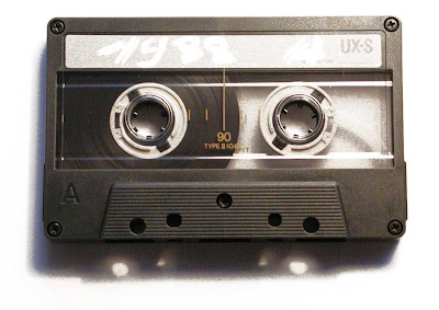
In today’s media world it seems almost a relic already, but there is a certain warmth to cassette tape that is hard to achieve in digital form, and even then it is 'fake'. Also, the cassette tape helps represent a certain mechanical approach to my work, and is also a tangible object that people can feel, rather than simply something that exists in ‘cyberspace’.

14/07/2008
Episode 02 - Brian
12/07/2008
Episode 01 - Bert
11/07/2008
Sight or Sound?
I’ve coupled Bert’s Podcast with some footage of him working on his plot.
This isn’t working as well as I was hoping it would do. The footage isn’t as fruitful as I hoped and I find the footage is acting as a distraction, drawing your attention away from what Bert is saying and the environment.
Comparing the two podcasts (one without the footage and one with) the one without the footage seems to be working best. As there’s no visuals to work with I find you rely on your hearing more, taking in little details that you may not have, such as birds singing and people working in the distance so you can to build your own image of what’s happening.
Bert - Podcast
Using the recording I have from my chat with Bert, I’ve edited together a short sound clip or podcast as it will surely become.
This is Bert telling of his lack of smell, his younger days and what the allotment is about for him.
09/07/2008
Podcasts - The Way Forward?
I could make the recordings available as podcasts. This would be an ideal format as it would package them nicely and make them easily accessible to a wider audience.
Podcasts are an ideal format as they’re a fast and easy way to get work online and publically available at no cost.
Using the podcasts I could create a series of episodes, each one a glimpse into the life of individual character on the allotment. Each one different from the rest as everyone is different from each other; all offering their own unique life experiences, stories, opinions, beliefs, emotions.
08/07/2008
Growth
I really like these short recordings that give a glimpse into the characters on the allotment.
It is the stories that unfold within the sound clips that make them so interesting to listen to; the allotment element almost becomes irrelevant, though I still think the atmosphere of the allotment is important.
This idea could be taken further by coupling the recordings to the video footage I have on the allotment. I wouldn’t like to use footage of the conversations themselves, but of the surroundings and things relating to the conversation indirectly. I would use this approach because I’d rather have a set of abstract images that compliment the subject instead of a straight ‘interview’ that might be less interesting and more of a distraction from what is actually being said.
The Right Conditions
It is the differences in plots that make the allotments interesting. Brian's methodical approach has resulted in a miniature 'world within a world'.
Club House
Greenhouses have many uses. In winter Bert transforms his greenhouse into a make shift club house complete with fire and seating arrangments.
05/07/2008
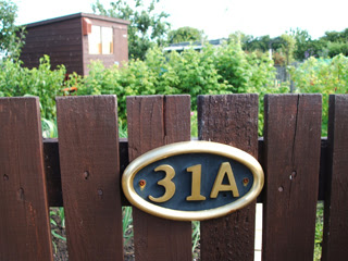
Plot Numbers
04/07/2008
The Allotment Painter

I recently discovered the work of Chris Cyprus. Chris is a landscape artist who uses the allotment as inspiration for his paintings.
‘It all started with the humble Garden Shed and old rustic Garages, 'I was fascinated with the textures and colours and to what was inside these time capsules'. This led Chris to the Allotments where he found inspiration and was overwhelmed by the passion and pride that people had for their plots.’ - allotmentart.com
I was excited to find someone else who can see the beauty and potential within the allotment, there’s so much creativity just buried there waiting to be discovered. It’ll be great to speak to Chris about his work and how he uses the allotment to cultivate his creativity.
Chris Cyprus’s website - www.allotmentart.com
A Trip Out
I visited Sefton Park Allotments the other day for the first time, I’m interested to see other allotments and if they differ from each other in any way.
To be honest I wasn’t expecting to find much of a difference between the two, maybe just the size difference as Sefton Park is a lot bigger than Rob Lane (I checked Google Earth).
The first thing I noticed was how free and wild the allotment seemed; there wasn’t much fencing and plots just butt up to each other without barriers. I couldn’t make head nor tale of them. The path ways were grassy, winding and not definitive; you could be walking along when you realise you’re in the centre of someones plot.
The rules didn’t seem as strict as Rob Lane; it felt more relaxed, more natural. There’s so much more greenery, lots of trees around and all sorts of plants and bushes. The plots range from the traditional to kitchen gardens and little hideaway dens to your average house garden. There’s such diversity, it seems you have more control over the plots at Sefton Park.
Although I wasn't there a considerable length of time, I felt more as if I were encroaching on people's hobbies, the people I came across were less forthcoming about their plots, and I didn't feel as welcomed as I did at rob lane. Although on reflection this is a much bigger allotment and it’s not viable for everyone to know each other, so another stranger isn’t going to make waves, also I don’t think me flailing my camera around helped. (They probably thought I was from the counsil hehe.)


Subscribe to:
Comments (Atom)
